

There’s been a flurry of Ballot Box Scotland activity over the past few days, as I finally completed the detailed data collation from May’s local elections. With a whole pile of data at my disposal now, we I kicked off a trio of wrap-up articles with a look at whether later preferences were being used. The preference theme continued with yesterday’s piece delving into where each party’s second preferences went. In this final piece today, we’ll move away from the charts and numbers (mostly) and instead into something slightly more fun – maps!
It’s not an election without a good map, and you’ll have seen plenty of them from me over the past few months. Even with the same basic map of Scotland, there are lots of different ways we can present various bits of data from May’s elections, and that seems a nice place for us to finish up. Please note that due to the highly detailed nature of some of these maps, file sizes are pretty big, which may cause issues for some phones!
Wards by First Preference Vote Lead

If you were following BBS in the immediate aftermath of the elections, you’ll have almost certainly seen this one already. This simply shows each ward coloured by the most popular choice for voters. As it’s intended as a general overview it treats Independents as a single bloc, showing where voters were most likely to vote for non-partisan options.
I’ve pulled together the total number of leads per party, but bear in mind that wards vary enormously in size in a way that constituencies in an FPTP election don’t. The smallest wards for Comhairle nan Eilean Siar can have only around a thousand electors in total, whereas in Edinburgh the largest are pushing nearly thirty thousand!
The SNP turned out to be the most popular party in over half of wards, with the Conservatives then chalking up the second highest figure despite placing third in votes overall. That reflects the distribution of votes, with Conservatives tending to do well in rural areas where the SNP are weaker, whereas they are much stronger in urban areas where Labour are competing. Independent leads are likewise primarily found in rural and island wards, the Lib Dems are heavily concentrated in key strongholds, and there’s just one little Green splash.
Of course, whilst simple maps like this have their uses, they can never be taken as the whole story of an election – especially not one that’s somewhat proportional. In addition, the transferrable nature of the voting system means that the party with the most first preferences isn’t necessarily the “winner” in a given area, as another party could overtake after transfers.
Wards by Two-Candidate Preferred Winner

That’s then what this second map does, using data I’d collated for every single ward in the country about who would win a single-seat election. It’s worth noting this works on the basis of candidates, and given what we know about how a fair chunk of voters don’t even use a second preference, there are some cases of very narrow leads here that might have been reversed had a party only stood one candidate.
However, we can’t distinguish between “voter not using the system properly” and “voter deliberately choosing not to vote for a second party candidate, per oft-argued benefit of STV.” As a result, I’ve just followed what the data says, and should a by-election arise in such a ward I’ll include that as a health warning in the analysis piece. Bearing in mind the same caveats as above though, we can again look at the numbers per party.
You’ll note that the SNP and especially the Conservatives, who are on nearly half as many leads by this measure, lose a lot of ground to everyone else. What particularly impacts the Conservatives when we’re looking for the single-seat winner is that almost everyone else is more popular in aggregate than they are, so unless they’ve got a big lead it’s easy to lose it. The SNP, who are more likely to have such big leads, are more able to weather anaemic transfer flows.
Labour outright double their number of leads, with transfers from pro-Union majority votes in many Central Belt wards. The Lib Dems likewise almost double their tally, primarily by overtaking Conservatives, but in a couple of cases overcoming SNP leads. Even the Greens snag a few extra leads in their heartlands in Glasgow and Edinburgh, and Independents crack some urban areas.
This is still however a visualisation that can suggest wards are monolithic entities, all voting one way or another. It doesn’t really allow room for nuance, either of geography or support spread.
Polling Districts by First Preference Vote Lead

This map addresses the geographic front, by breaking results down into polling districts. This is probably the bit of data I most enjoyed looking at from my massive data collation project, because it allows you to see some of the demographic differences within each ward – as well as the efficacy of campaigning. This often leads to a more fractured visual than the ward-level equivalent, as you find stretches of SNP yellow in rural wards that might have seemed resolutely Conservative, whilst the Greens may poke some holes in urban wards.
Another way this differs from the ward-level map is that because it’s meant to give a more localised picture, it also treats Independents completely separately. In some wards with multiple Independents, albeit fewer than I expected, you can even see different candidates leading in different areas.
In addition, whilst I’ve tallied up the total numbers again as a matter of interest, polling districts are much more arbitrary divisions than wards and thus have a huge variation in number of voters. Some districts are also so small it’s impossible to disaggregate their data from larger districts their votes are merged with, and so particularly in rural areas some of the nuance is still lost.
As with ward leads, the SNP end up leading in more than half of polling districts – my data has exactly 3000 districts in it, though the actual number is slightly higher than that, some of which are completely “empty” of voters and just exist to parcel off bits of land where boundaries of different levels of election are interacting oddly.
Even when we’ve introduced this level of local geographic nuance, there are still some deficiencies in the visualisation that have to be kept in mind. Most importantly, colouring entire areas based on leading party visually inflates the impact of rural areas over urban areas. This is a well known issue in presenting e.g. UK Parliament or US Congress results via maps, which alternative map styles might seek to present by using equally sized hexagons, or stretching and squeezing districts so they fit their number of voters. I haven’t yet figured out how to do that in QGIS, but I’ve got a solution nonetheless!
Polling Districts by First Preference Vote Lead (Built Area)

I really love this particular map, I think it looks extremely cool, but due to the level of detail it’s also a relatively massive file size, so bear that in mind if your phone is struggling with it! What I’ve done here is overlaid the polling district lead map with buildings, so only built up areas are shown in colour. It’s still not capturing density, as a semi-detached pair of bungalows will have the same footprint as a four storey tenement, but it mostly does the job of showing where people actually live.
In the context of May’s elections, this somewhat reduces the visual power of both the Conservatives and Lib Dems, who had quite a lot of leads in the most geographically expansive but lead densely populated districts. In fairness, the SNP lose a lot of those around the Highlands and Argyll too!
All of these maps so far have looked at leading parties, just of varying definitions. As I’d mentioned earlier, that doesn’t really give us a grasp of how each party’s vote was actually spread, as a lead of one vote leads to the same colouration as a lead of a thousand. Whilst it just wouldn’t be possible to meaningfully show every party’s support on a single map, you could do it via individual maps for each party.
Wards by Party Vote Shares
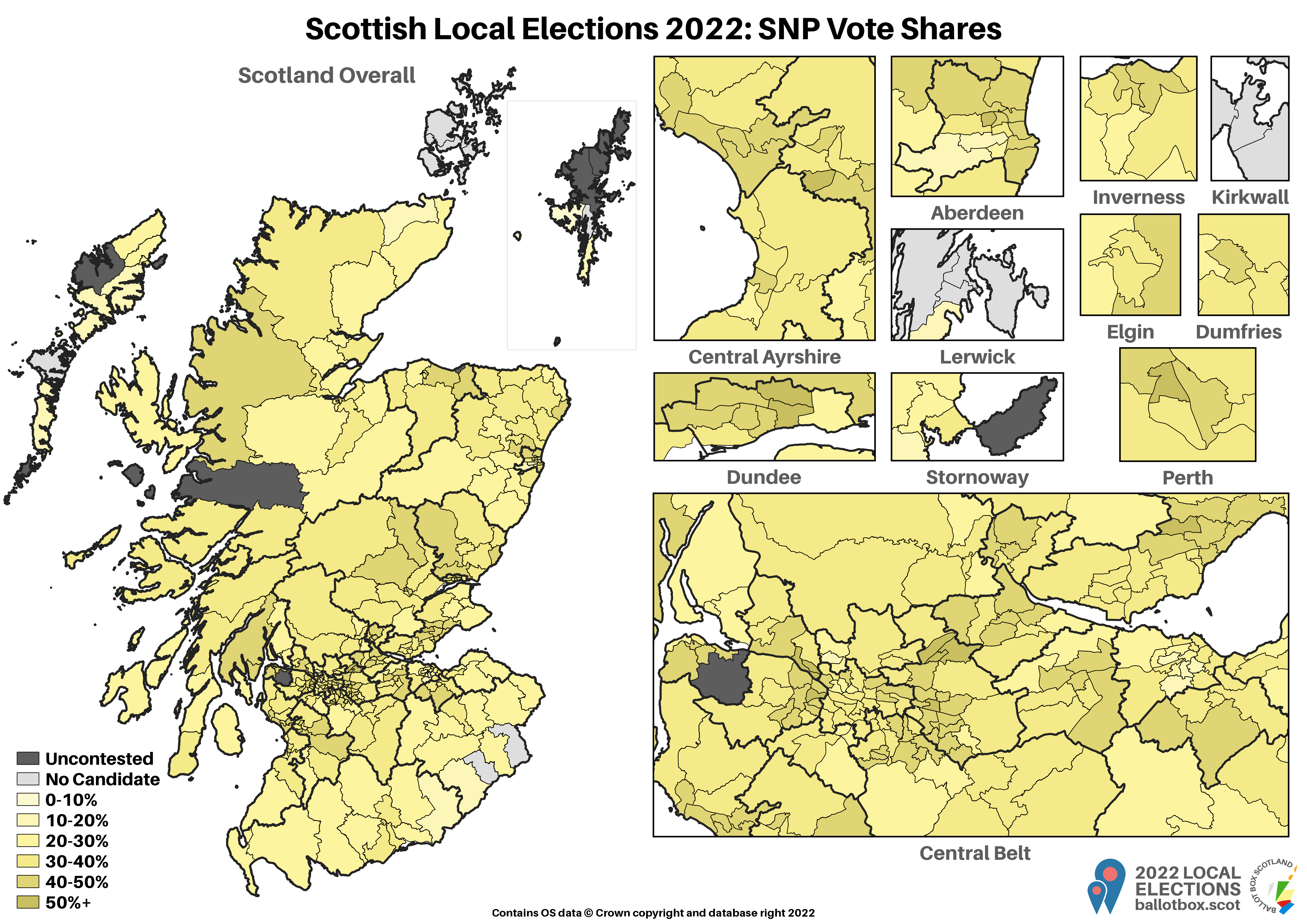
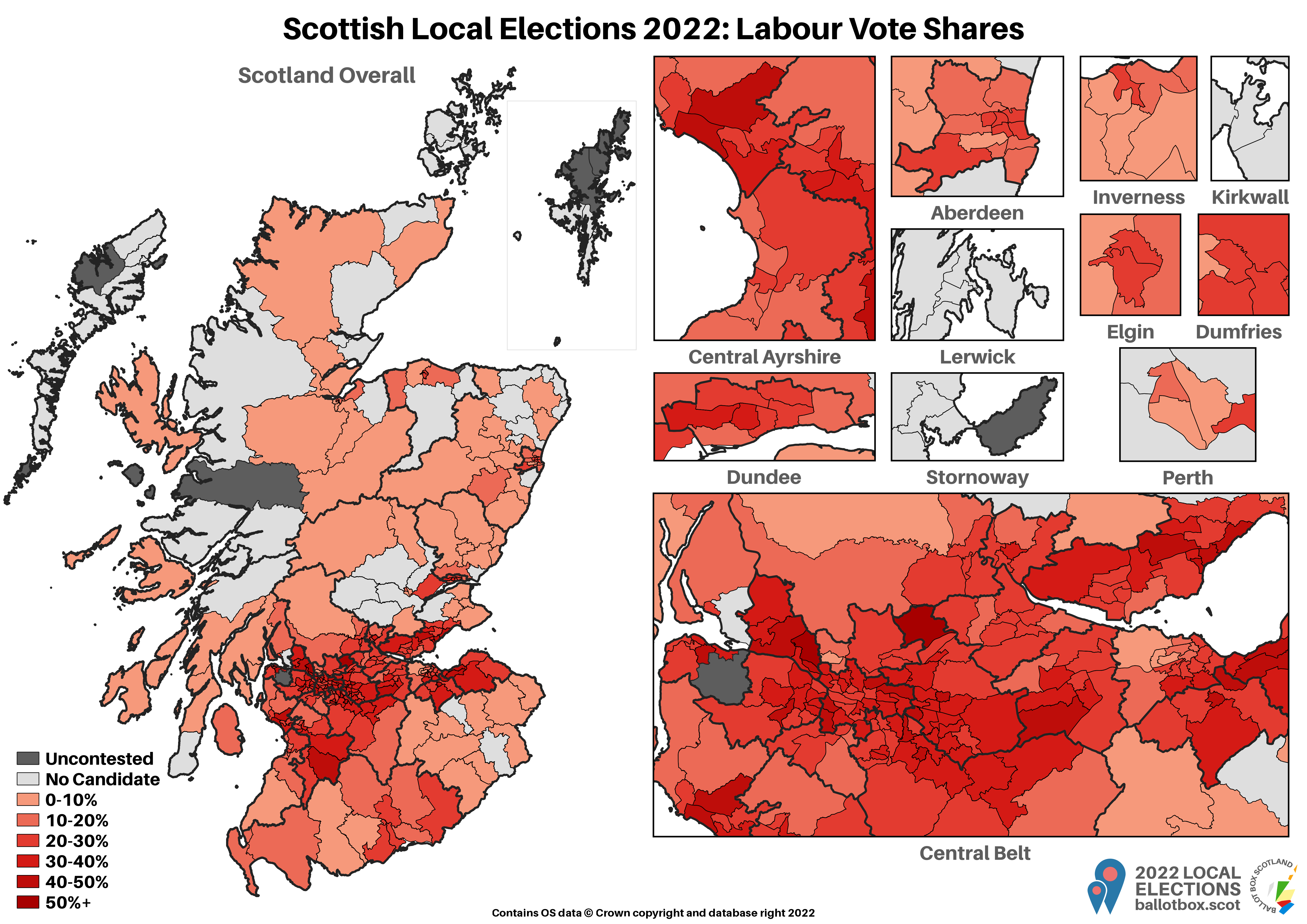
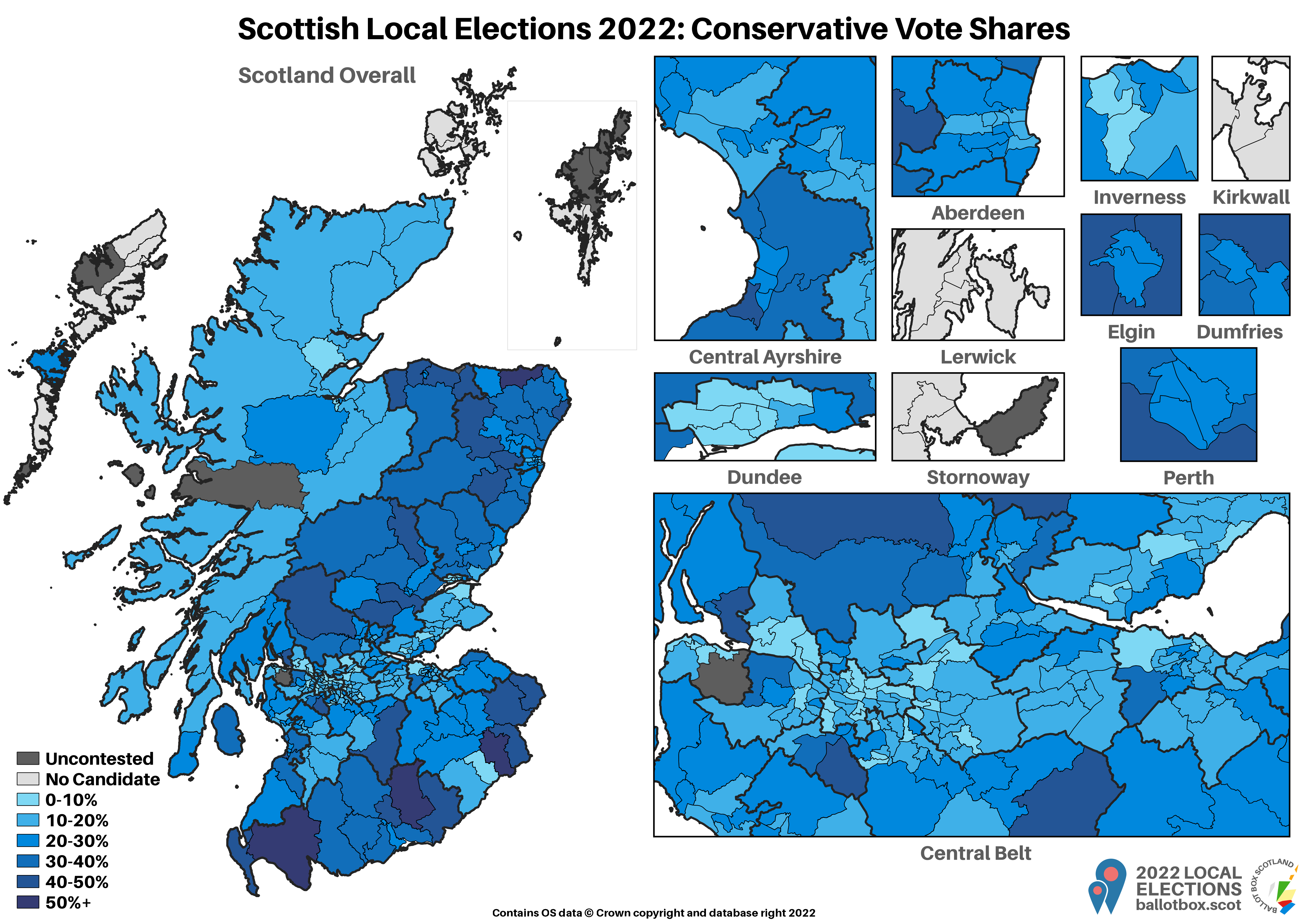

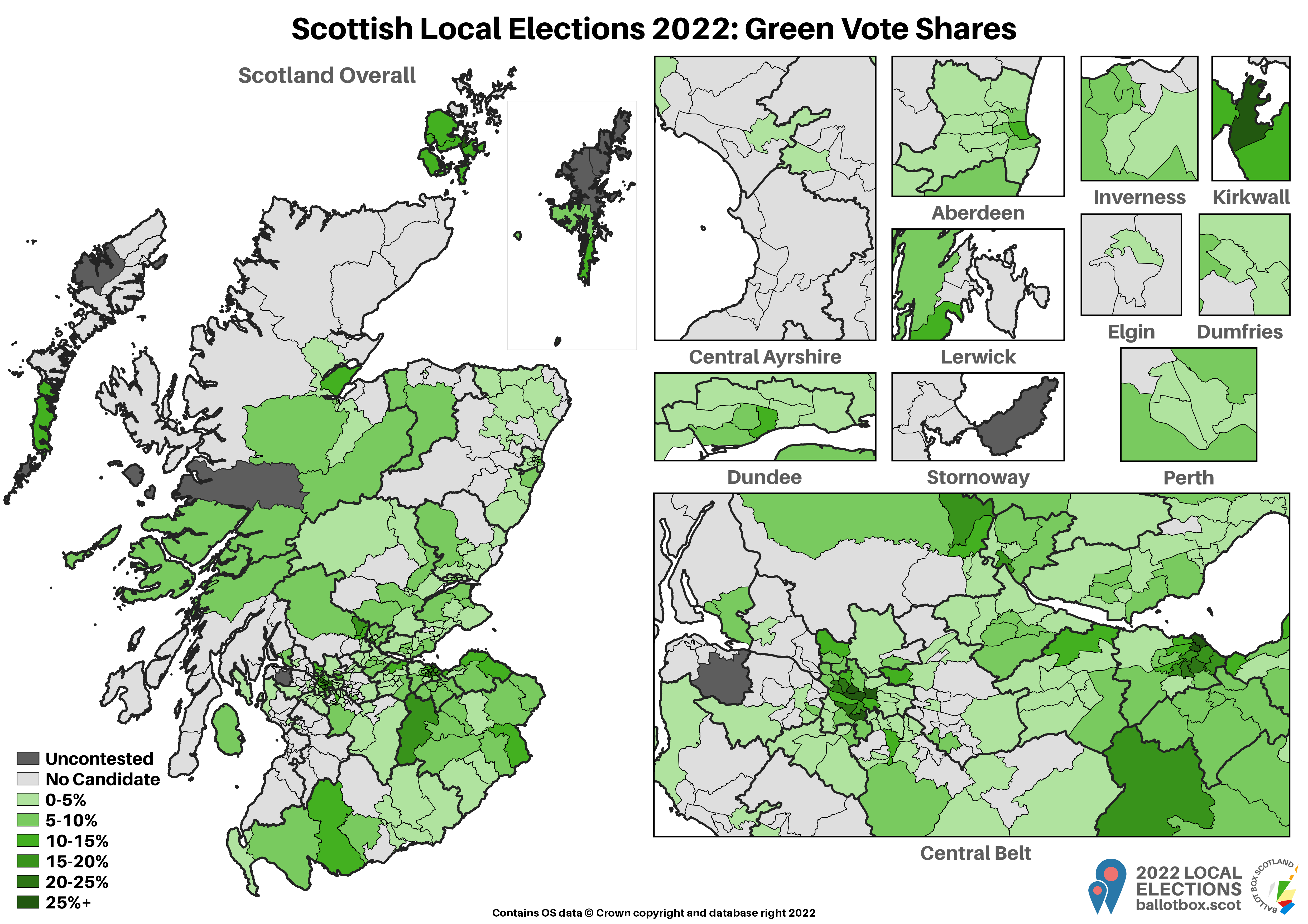
I wrote about these particular maps at length right after the election, so I won’t re-hash that piece here. Nice interactive versions of these maps are available there, but I’ve included the image versions here. I’d like to claim there was something clever in how, for the big parties, I’m using 10% bands in these maps and 5% bands in the polling district maps, but actually it’s just unthinking inconsistency.
Polling Districts by Party Vote Shares
These maps then show spread broken down even more locally into polling districts. Whilst vote shares usually cluster reasonably closely round the overall result in the ward, it’s not always so clear cut. You’ll find plenty of districts where a party with a strong result in the ward overall actually did very poorly, and vice versa, patches of particularly intense support even in weak wards.
That's all, folks!
And with all of these very detailed (and very large!) maps out of the way, that’s a final and complete wrap on the Local Elections 2022 from Ballot Box Scotland! These elections have basically consumed my life for the past six months, with the Wards Worth Watching series, lots of other analysis, and my first ever commissioned poll before the election, then collating the most detailed set of election data ever published in Scotland’s history afterwards.
This has been an enormous undertaking, especially the post-election data collation, which I estimate averaged out at half an hour per ward. There’s 355 of them, and that’s not counting the many other hours spend preparing, double checking, correcting, and staring in blank incomprehension at why things weren’t adding up.
I’d like to extend a massive thank you to the council election teams across the country who assisted with my queries, my own little team of volunteers who helped on count day, and anyone who has shared and enjoyed my output over the past few months. I’m always very grateful for the generous support this project receives, and you’ll indulge me if after all of this effort I again point out that if you value my work and have the means to do so, you can donate to support it at the link below.
Now, I think I’ve earned a well-deserved rest. I may have to quickly pull together full analysis of last week’s North Isles by-election, but otherwise I intend on taking the next two weeks largely away from Ballot Box Scotland. I will, of course, cover any polls that are published in that time (I’m a bit worried we’re due one) but otherwise, things will be nice and quiet!
If you find this or other Ballot Box Scotland output useful and/or interesting, and you can afford to do so, please consider donating to support my work. I love doing this, but it’s a one-man project and takes a lot of time and effort. All donations, no matter how small, are greatly appreciated and extremely helpful.
(About Donations)