In this piece a couple of days ago, we took a look at each party’s spread of representation across Scotland – what wards and what councils they had seats in. Today, having had most of yesterday off BBS, let’s look at the spread of votes across the country. Unlike the previous piece this comes with shiny interactive charts, though you can find image versions in this Twitter thread. For each party, we’ll be looking at a number of measures:
- Overall vote: How many votes were actually physically cast for them on the day?
- Contested ward vote: How many votes were cast for them, counting only the wards that party contested?
- Average: Average vote share across all contested wards.
- Median: Median (middle) vote share across all contested wards.
- Best: Vote share in strongest contested ward.
- Worst: Vote share in weakest contested ward.
Before we do so, it’s worth having a refresher on how many wards each party was contesting, out of the 355 across the country.
However, we have to remember that not all wards are the same size. Wards in the city council areas have many more voters than those in islands council areas, for example. The most votes cast in a single ward this year was 13,909 in Edinburgh’s Almond ward. That compares with just 661 in Comhairle nan Eilean Siar’s Uibhist a Tuath ward.
It’s therefore useful to look at the total share of votes cast in the wards each party was contesting – i.e. out of everyone that turned out to cast a valid vote, what proportion of them could have voted for each party?
So, the proportion of all votes up for grabs was notably higher for every contesting party. That shouldn’t be a surprise, as the islands were only marginally contested, whereas the cities were much more widely so. Indeed, were it not for one missing Lib Dem in Glasgow, the Holyrood 5 would have stood in every ward in all four city councils for the first time this year.
⚠️Importantly, none of the vote shares below are to be taken as an indicative of “national” vote share if every ward was contested. They are useful and interesting statistical figures, but estimating such a vote would be a different matter entirely.⚠️
SNP
Votes this year
As the SNP’s contest rate was so high, there’s very little difference between their share overall and purely in the wards they contested. Similarly, their average and median figures are pretty close too, indicating that the SNP continue to have a pretty well spread vote. That’s one of the features that has defined their era of dominance in Scotland relative to Labour’s, as the latter were always much weaker in most of rural Scotland.
In terms of areas nonetheless strongest, we can see particular concentrations of high votes in a few places. There’s the middle of the Central Belt, especially in North Lanarkshire. That’s where their strongest ward, Cumbernauld North, was located. Places like Clydebank, Paisley, Greenock, Irvine, Livingston, Clackmannanshire and Glenrothes also show up as particularly deep tones.
Moving outside the Central Belt, naturally Aberdeen and Dundee are pretty strong, as is Inverness. You can also see how the SNP recovered in some of their historic strongholds in Angus, Perthshire, Moray, and the northeast corner of Aberdeenshire.
A lot of the paler colours are to be found particularly in the Borders, southern Edinburgh, Bearsden, North Berwick, and the Lower Deeside area of Aberdeen – not surprising, as these are some of the very few areas the SNP didn’t elect councillors in one or both of the past two elections. The weakest wards overall, including Shetland West which was their absolute lowest share, are on the Islands, so that’s perhaps understandable. On the mainland, Annandale East & Eskdale in Dumfries & Galloway was their worst performance.
Vote Over Time
Looking at the SNP’s vote over the STV-era elections, and it’s a story of consistent but generally slow progress. Remember that in 2011 at Holyrood they vaulted to 44% of the list vote, and haven’t been below 40% since then. For whatever reason, the SNP just cannot get their parliamentary support to translate to the local level – albeit that at the time of this election, their average polled list vote share was about 34%, which this closely mirrors.
However, that means the opposite is true – local elections have never been an accurate reading of how well the SNP will do at a parliamentary election. Anyone taking these results to suggest the SNP will suffer the next time we got to the polls for the Scottish Parliament has to contend with the fact that such results locally have twice before failed to presage the end of SNP government.
Labour
Votes this year
Labour’s contest rate is pretty decent, albeit notably lower than the SNP or Conservatives, so there’s a bigger but still not massive difference between their actual and contested ward share, and then their average and median are on a par with that. Bear in mind that Labour’s absences are overwhelmingly in rural wards, which you can see from the above map tend to be very weak for them. That’d drag the average and median down a good bit if they did have a full contest rate.
As you’d expect, Labour’s base of support is clearly concentrated in the Central Belt. Amongst what is generally a very deeply tinted part of the map for Labour, places like West Dunbartonshire, Kilwinning and the Three Towns, Cumnock, Dalkeith and Tranent show particular leads, as does Kilsyth in North Lanarkshire and Kilpatrick in West Dunbartonshire, which was their strongest ward.
In addition to the rural areas noted above, including the Borders, Perthshire, Angus, Aberdeenshire and Highland, Labour were especially weak in Western Edinburgh, North East Fife, where they had their lowest share in East Neuk & Landward. Although substantially darker tinted than surrounding areas, note that Dundee and Aberdeen are generally less strong for Labour than Glasgow and southern Edinburgh.
Vote Over Time
A useful reminder in this chart that whilst this election represented progress for Labour, it was quite modest. That’s certainly not to diminish the fact they’ve done well after a decade of decline, but their share is still very far off what it was before the referendum. Labour’s return to second was a lot less to do with a surge in support, and more to do with a collapse for the Conservatives.
Conservative
Votes this year
A very high contest rate for the Conservatives means there’s not much between their actual share and what it was in contested wards only. Their average is also relatively close. Unlike the two other large parties, their median is substantially lower. The map above is a clue as to why that is – where the Conservatives are strong, they get a lot of votes, but there are a lot of weak areas still, particularly in the Central Belt. There are more of those latter wards, so it pulls their average down.
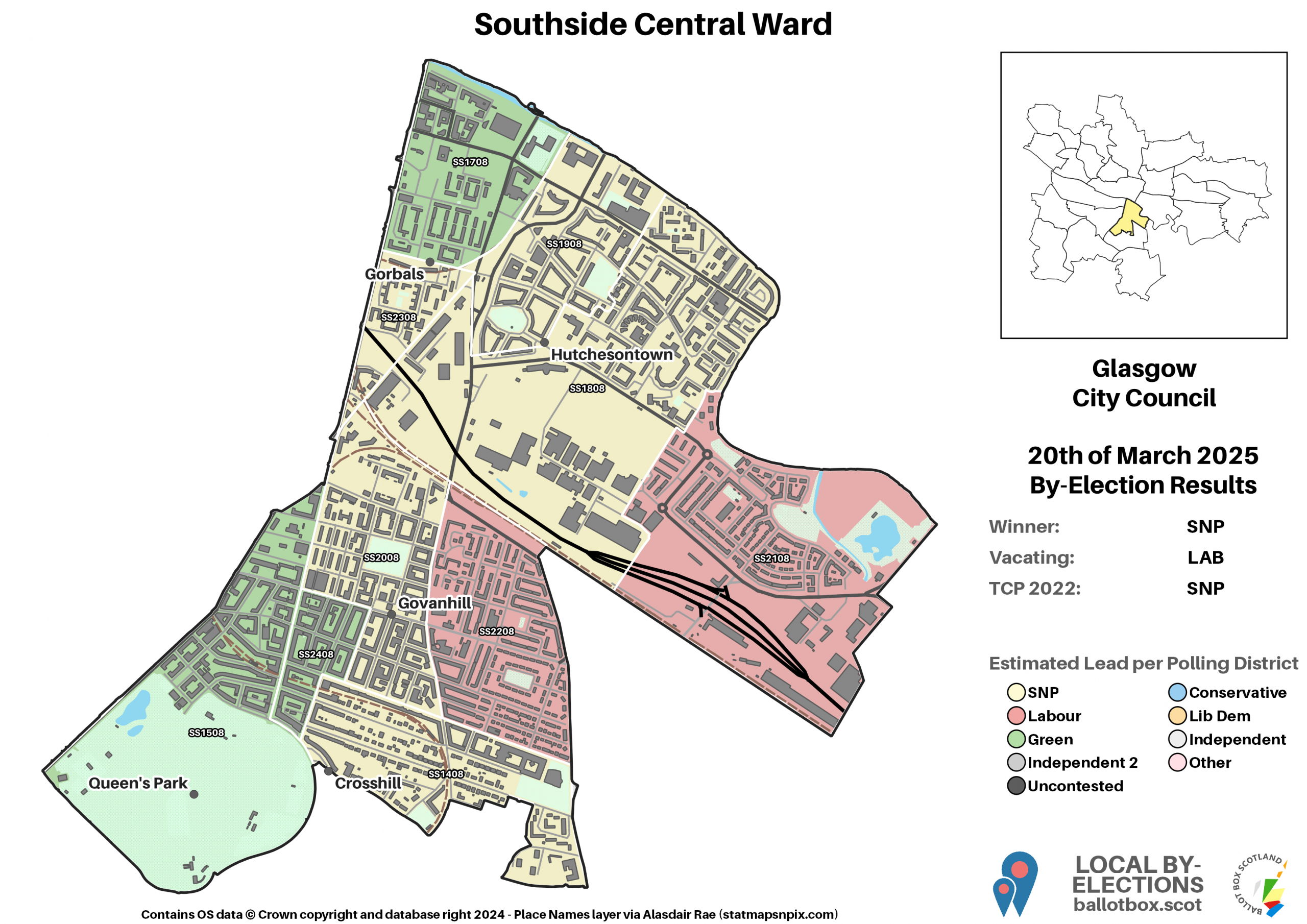
Indeed, zooming into the map and you can see why West Dunbartonshire, Glasgow and North Lanarkshire were such a disaster zone for the Conservatives this year. A big concentration of very pale blue wards, which you can also see in Greenock, Leith, and Dundee. Although they scraped two councillors over the line in Glasgow, they also recorded their weakest vote share anywhere in the country in the Southside Central ward. Even what are typically strong Central Belt areas for them, like Edinburgh and East Renfrewshire, have faded a bit this yaer.
Overall, the Conservative spread on the map looks very bottom heavy, as it usually does. Their support is strongest in Dumfries & Galloway, where their best ward Annandale North, is located. The Borders also generally remain strong, though the loss of over 10% of their vote there has large parts looking much paler than previously. Away from the south, still good performances for the Conservatives arcing up from rural Stirling through Perthshire, Angus, Aberdeenshire and Moray.
Vote Over Time
As if to illustrate the point I’d made under the Labour equivalent of this chart, this is a very sharp drop for the Conservatives. That’s what took them tumbling below Labour. However, it’s still substantially ahead of what they got in their rock-bottom year in 2012. Although it was expected that the Conservatives wouldn’t quite replicate their 2017 high water mark, based on Holyrood last year they should have been headed to something like 23%, not falling below 20%.
It’d therefore be hard for the Conservatives to argue that this year has been anything other than an extremely bruising setback, and one that could yet reverberate across other levels of election and see them pushed back into third in every arena. But this is nowhere near a 1997 scenario. The party have gained substantial support over the past few years, and they’ve still kept hold of much of that.
Lib Dem
Votes this year
As we move onto the two smaller of the major parties, we start to see more substantial differences between the various measures due to their much lower contest rates. In particular, whilst the Lib Dem vote in contested wards was only slightly above their average, their median is about half that value. That makes sense when you look at the map above, where so much of it is very pale. If you look at some of the pale tinted wards next to grey, no-candidate wards, you’ll often see shares well below that median, as in their weakest ward of Garnock Valley, where they didn’t even get one full percent of the vote.
That neatly illustrates how, although this was a very good election for the Lib Dems, much of the success came from a small number of places. Compared to the other parties, the darkest toned wards really stand out, almost exclusively located in the areas of North East Fife and Edinburgh Western. The latter contains Almond, not just the Lib Dems’ strongest ward, but the ward with the highest first preference share for any party.
You’ll also spot some isolated dark spots in the west ends of Dundee, Aberdeen and Inverness. Less vivid but still strong tones can be seen in Aberdeenshire, Highland and Argyll and Bute. Aberdeenshire in particular will be a relief for the Lib Dems, as a poor result there at Holyrood cost them their North East MSP last year. Combined with solid growth in Dundee, they can be feeling confident of picking that seat back up, at least for the moment.
The growth in those areas helped, in the national figures, to disguise continued low shares elsewhere. Across most of the Central Belt the Lib Dems barely registered. This is especially true in the west, where outside of East Dunbartonshire and Helensburgh, they generally got less than 5% of the vote, if they stood at all. They’ve continued to go backwards in Glasgow, the only major city they don’t have a seat in.
Glasgow is to all intents and purposes a lost cause for the Lib Dems now anyway, but West theoretically remains a prospect for gaining an MSP. That may remain distant under these figures. Finally, though they had a decent result in a number of wards, it’s notable that the Borders is one historic Lib Dem stronghold a major revival has bypassed. Similar to West, they need growth here to pick up an MSP in 2026.
Vote Over Time
Paralleling Labour, when we chart the Lib Dems’ vote share across the STV-era local elections, this year was definitely an improvement for them, but it’s a long way off where they were in 2007. That said, they have every reason to be happy with this result, given after last year’s Holyrood election I practically had the party on death watch.
However, the question remains whether this is the start of a genuine revival for the Lib Dems, or if it was a further bedding in to the areas they are already strong at Holyrood, and otherwise benefitting from the protest votes of folk scunnered with the Conservatives. If it’s to be a revival, it’ll need to begin to make more of an emergence from those strongholds.
Green
Votes this year
Just like the Lib Dems, the Greens have a bit more of a gap between their various figures here. However, it’s not as stark as for them, and indeed the Green median share is about equal to the Lib Dems’, whilst their worst share is a bit higher. Although the Greens have areas of clearly concentrated support, they also generally have a higher baseline than the Lib Dems do across the country. As I’ve noted previously, that distinction partly explains recent differences in representation. Green support being well spread helps them at Holyrood, but hinders them at the locals, whilst the opposite is true for the Lib Dems.
In what was a pretty astonishing result for the Greens , their vote generally increased nationwide. Naturally, the strongest Green shares are to be seen in Glasgow and Edinburgh, where they elected the most councillors. Interestingly, the Glasgow wards with Greens are generally a slightly deeper tint than their Edinburgh counterparts, illustrating the degree to which the centre of Green gravity has been shifting. The Green vote lead in Hillhead is by far the largest share they’ve ever won in a single ward – although two Edinburgh wards had Green leads in 2012, that was a function of a fractured voting spread, with one at around 25% and the other at 20%.
Other notably strong areas include Dunbar, Tweeddale, Alloa, Dunblane, Orkney in general but especially Kirkwall where they had a formerly Independent councillor on the ballot and now represent both wards, and parts of the Highlands. Areas of more moderate strength but without seats include parts of Galloway and rural Perthshire, plus those particular spots of Dundee and Aberdeen where they were close to councillors.
Interestingly, despite it being their weakest region at Holyrood last year and the only one to miss an MSP (narrowly, and due to a microparty causing confusion on the ballot), where they contested wards in the South they generally did well, and in fact better than they did at Holyrood – especially in the Borders, there are far fewer wards in the palest tone than in areas like West Lothian, Falkirk, Aberdeenshire and North Lanarkshire which are covered by Green MSPs. That last one is home to Coatbridge South, which was the lowest Green share. All of this bodes well for Green prospects for both holding their Holyrood seats and plugging their one gap.
Vote Over Time
A very clear upwards trajectory over the past decade for the Greens. In 2017 that was driven in party by contesting many more wards, which is why the share in those contested fell back down – in 2012, the strongest Green wards with councillors made up a lot more of their total share. This year, with the Greens only standing in a relatively small number of additional wards (21 more in total), most of that increase will therefore be down to more people choosing to vote Green, rather than more people who would have anyway finally being given the option.
All in, this is further evidence of a very simple truth – that the Greens have established themselves as major players in Scottish politics, with a base of dedicated support. I think there’s more to be said about this, and how an ongoing lack of understanding of this is one of the big blind spots of a Scottish political discourse that still struggles to unhook from Westminster ways of thinking, but that’s a much longer piece!
Alba
Votes this year
Moving onto the first of the two parties which won no seats but quite widely contested the election, Alba again posted a poor result. Their vote share across the wards they contested wasn’t meaningfully different to their result last year. In relative terms, the median being 1.5% is quite a big gap, and suggests that had the party stood in more places, they would be likely to come a bit under the 1.8% mark rather than improve on it.
It’s worth bearing in mind that unlike Holyrood, Alba could at least claim to have incumbents in this election, standing a number of defecting councillors – the number I’ve seen is 13 such faces. That should in theory have given them an advantage over the average Alba candidate, and we did indeed see higher Alba shares in the likes of South Uist, Fraserburgh, Motherwell North and Inverclyde Central. However, their best result actually came from a non-incumbent in Glasgow’s Southside Central.
A bit over the other side of the river, in Partick East/Kelvindale, they recorded their worst result of any ward contested. Bar those few exceptions above, Alba candidates barely registered. Even in Dundee, the only place they stood a full slate of candidates, their total share of 2.4% was a smidge below their Holyrood figure of 2.6% – and their defecting incumbent actually only won the third most support of any of their candidates in the city. It’s plain for all to see this is not a party on the up, and no amount of being absolutely bealin on Twitter can change that conclusion.
I’ve previously made comparisons to Solidarity, but I concede those may be unfair. At their first council elections in 2007, Solidarity elected a councillor, and won 4.7% of the vote across Glasgow. They won 0.9% of the vote across 83 wards nationwide. At the concurrent Holyrood election, they were within 1% of a seat. Their vote share at that election was around one-fifth of the peak share the party they had split from achieved under the splitting leader’s term, and in fact they overtook the party they split from. By all of these measures, Solidarity were doing a lot better at birth than Alba were, and they failed anyway. Am I saying that’s guaranteed in this case? No. Am I saying it’s likely? Highly.
Family Party
Votes this year
Our other “minor but widely contested” party this year was the Scottish Family Party. Their figures are all basically identical across the contested, average and median measures. In contrast to Alba, that would represent an improvement on last year’s Holyrood result, when they achieved 0.6% of the vote. Also unlike Alba, the SFP didn’t have any incumbent councillors with personal votes to bank on, nor does it have the profile of being headed up by a former First Minister. And yet, it performed nearly as well.
“Well” being a relative term, as even 1.3% isn’t anything to write home about, and we’ve seen any number of such socially conservative parties spring up over the years, get 1-2% (including at Holyrood elections), and then dissolve into nothing. For the moment though, this lot did best in Mid Berwickshire, with other particularly strong wards in Wester Ross, Keith & Cullen, north-central Aberdeen, and Clydebank. I cycle through the latter ward very regularly so I’m going to have to be extra gay when doing so from now on, apparently.
Some of the wards on the lower end of their share were in more central parts of Edinburgh – had they stood in Glasgow, I’d imagine we’d have seen similar patterns. Their absolute weakest result was, oddly enough, in North Berwick. The coastal stretch of Berwickshire and East Lothian was much weaker in general though, so I dunno if the Mid Berwickshire candidate was a particularly weel-kent local face or something, because it seems odd that side of the area specifically would be more likely to vote for such a party.
Phew! That’s a lot of information, right? Having covered a lot of the national picture by this point, my priority will be moving onto more of the local detail. I’m already beginning to compile transfer round data for Glasgow, and will hopefully be able to pull together all of the other detailed data for the city very soon. That’ll allow me to launch it as the first of the completed pages, with more data than you’ll know what to do with. At a guess, I’d say it’ll take me at least a month to fully complete this process for every council, not least as I actually have to go back to my day job next week!
I’ve also got at least one more article brewing about the results overall, but that’s dependent on finishing up Glasgow specifically. As I so often do at Ballot Box Scotland, I want to take a look at the issue of proportionality and how choice of voting system impacts outcomes.
If you find this or other Ballot Box Scotland output useful and/or interesting, and you can afford to do so, please consider donating to support my work. I love doing this, but it’s a one-man project and takes a lot of time and effort. All donations, no matter how small, are greatly appreciated and extremely helpful.
(About Donations)