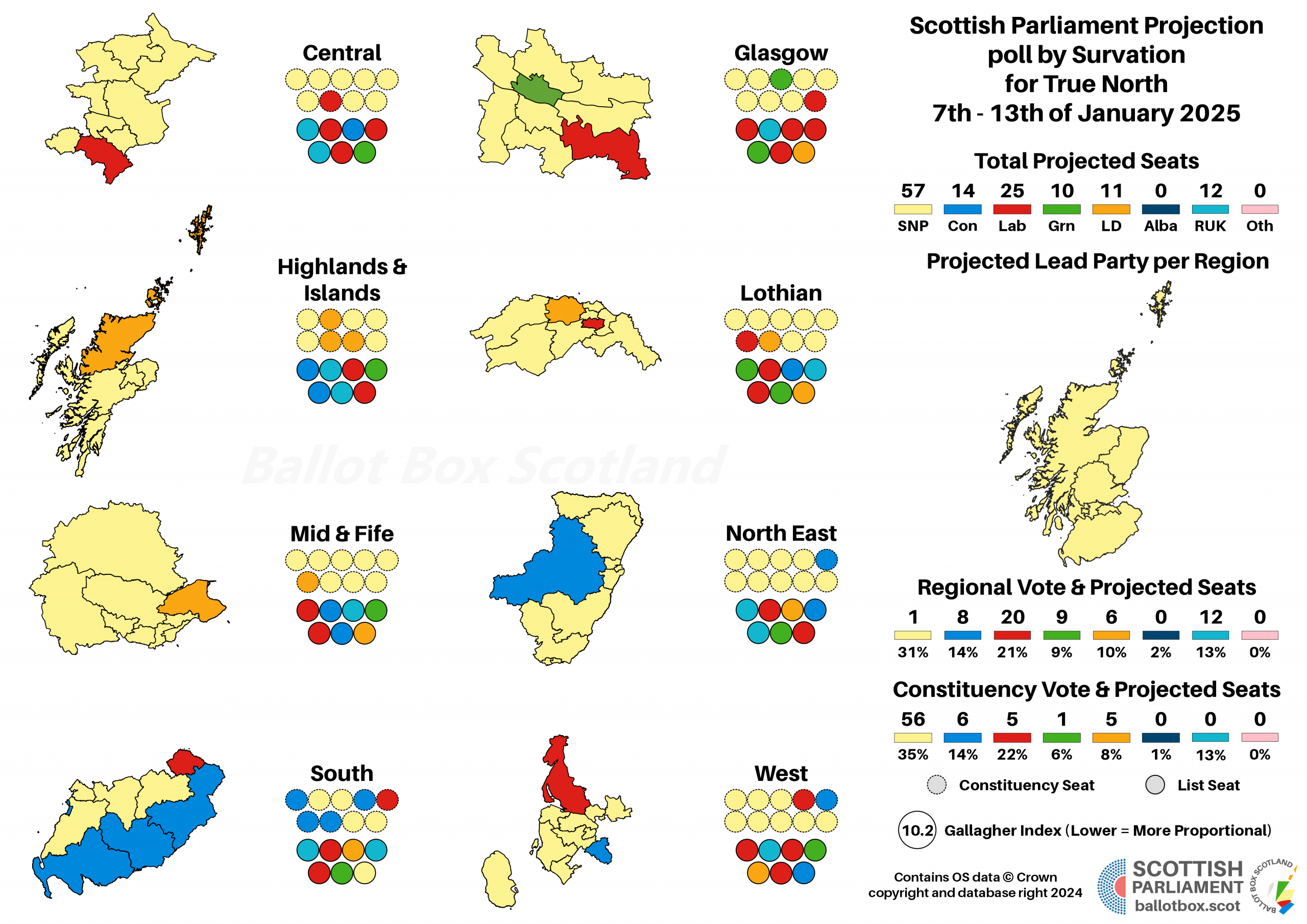
In the (just over a) week since the local elections, I’ve been plugging away at data collation. All 32 councils now have their headline figures for both votes and seats up on dedicated pages, linked to from an overall results page here. That’s only the beginning of the process however.
Beyond the first preferences and transfers per ward, that you’d generally expect to see, thanks perhaps to the fact we machine count local elections, we have a wealth of data available to us. This includes a complete record of all preferences as marked by voters, and breakdowns of where votes were at polling district level. As far as I’m aware, no one has ever collected all of this data into one place for easy consumption. Until now!
Starting with today’s publication of the full data for Glasgow City Council, I’m going to be doing exactly that. I reckon it’ll take me at least a month to complete every council – I’ll be going alphabetically from now on, though that depends on councils having the correct data available – but I will get there eventually.
In other countries, this sort of data would actually be put together by the central electoral authority – just a few weeks ago I was following the Slovenian parliamentary election, and could find all sorts of local data online. Unfortunately, the legislative and resource limits on the UK’s extremely hard working elections teams don’t allow for that sort of thing here. That’s where I come in.
Readers familiar with BBS’ coverage of by-elections will recognise a lot of this stuff, but I thought it was worth putting together an explainer anyway, so you know what all this data means.
Detailed Data Explanations
All of the below charts are interactive – you can tap them to see the actual number of votes. A spreadsheet of the data will also be made available for each council. In the longer term, I might then refine that further into something more easily utilised for your own data analysis purposes. I’m also using charts from different wards for these examples, to get a diverse spread of results.
First Preferences
This is pretty simple – the first preference votes in each ward. In most cases, these are shown as simple party lines, as for example the Conservatives above. Where parties have stood multiple candidates, there’s both a total (indicated by the black border) and a per-candidate breakdown. Candidates are listed by initial, and you can refer to candidate data on the page to check full names.
Transfers
These charts show the transfer process that took place, and thus how votes moved to give the councillors the ward finally ended up with. Note that transfer rounds can get very close, so it’s sometimes just not possible to easily see exact numbers on the interactive chart.
Ward Map

Each ward has a relatively simple map, with a buildings layer so you can get a sense of roughly where the voters actually are. Each polling district is coloured according to the party with a vote lead there, so you can tell at a glance who was strongest in each area. These are intended to be zoomed into for best use, so if you can’t make out district numbers, get zooming!
Results by Polling District
These charts then actually show the votes per polling district, so you can see beyond just who had the (often very narrow) lead. Note that these are estimates combining the ballot box data (for in-person votes) with a simple apportionment of postal votes. I.e. if 10% of a party’s in-person support comes from a given district, I assume 10% of their postal votes came from there too. Obviously it’ll be less clean cut in reality, but I felt these apportionments would still give a more accurate idea than treating postal votes as entirely separate.
Similarly, in the raw data provided any ballot boxes with fewer than 200 votes in them are “merged” with others, to protect voter secrecy. In some cases this can combine votes from two districts. Where I have the electorate information to do so, I’ve simply de-merged these based on the likely size of each box.
Where each district only had one box merged with another, that just gives identical proportions in each district. Where a smaller district was merged with a larger one, it more usefully gives an estimated separation of the two. Districts with de-merged boxes are marked with special characters (such as ^, *, ~ or !) at the end of their name, so e.g PDI001^ and PDI002^ would share at least one merged set of boxes.
Second Preferences
These charts show the second preference breakdown by party. Note that this is effectively “next preference after a given party”, rather than pure second preference. We know that most Labour voters, for example, would vote Labour 1, Labour 2 if they had two candidates, so it’s not useful (for these purposes) to know that. Instead, we want to know what they do afterwards – so if they go Labour 1, Labour 2, Lib Dem 3, that counts as a Labour to Lib Dem second preference.
The labels at the bottom show the first preference party, and then the bars are the second preference. So this example starts on the left with how SNP voters used their next preference, then how Labour did and so on.
Two-Candidate Preferred
This uses the same preference data to work out who would have won out of all the parties (and candidates) standing if there was only one seat up for grabs. If a by-election rolls around in a given ward, this is who the “defending” party is in strict electoral terms, rather than who has vacated the seat.
As in some parts of the country this will have an Independent in first or second place, where that’s the case I’ll do a second version that only has party candidates, so you can get a handle on the partisan spread. The exception will, of course, be the Islands councils, where that information will be less useful.
Hopefully all of this detail is as interesting to some of you as it is to me! One little advantage of doing this, in democratic terms, is it makes this kind of information publicly available. Until now, only those who knew how to crack this data open, or for other elections had people sampling at the count, had this kind of knowledge at their fingertips. By the end of the summer, any activist or organiser from any party will be able to use this to help plan their campaigns.
If you find this valuable, either now or because you’ve found it at some point down the line, please do consider donating to support Ballot Box Scotland. I love doing this and I’m fascinated by the data, but it’s absolutely painstaking work – it took me about three full days to pull Glasgow together, though it is of course the largest council. I go back to my day job on Monday, so I’ll only have so much free time to work through the other 31 councils, though I’ll do my best to get through it all as fast as possible.
If you find this or other Ballot Box Scotland output useful and/or interesting, and you can afford to do so, please consider donating to support my work. I love doing this, but it’s a one-man project and takes a lot of time and effort. All donations, no matter how small, are greatly appreciated and extremely helpful.
(About Donations)